

Aston Villa to Receive New Badge Design
Aston Villa will be looking to have a new crest design in place before the 2023/24 season kicks off (club’s announcement below). The badge roll out will tie in with the new North Stand expansion of Villa Park.
Aston Villa received its current badge in 2016, when the main update from the previous badge was the removal of the ‘Prepared’ motto within the shield. The prime reason, for what ultimately was a minimal change, was to have more clarity on social media with the AVFC and lion increasing in size, which helps on social media profile pics etc.
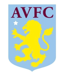
There’s been mixed opinion on the current badge design from Villa supporters, but it has been highly rated from outside articles that have judged all Premier League badges against each other.
The badge is fine, but for MOMS’ money it has two deficiencies. If you are the most beautifully and uniquely named club in English football, why not have the name on the badge? Also, there’s too much yellow compared to the principled Villa colour of claret.
Most Villa supporter’s favourite badge is the round badge of 1973 to 1992, which was synonymous with both Villa’s last league title win and European Cup win.
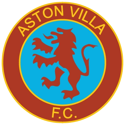
While it’s best to keep an open mind and start with a clean slate when approaching a new design, the round shape does incorporate the full name rather well. The old round badge also got the colour balance right of claret and blue, with the yellow acting simply as a trim colour.
Aston Villa’s Club Crest Lion History (and Scottish Heritage) will no doubt lead the way of any new design, but the future must be considered too, with the scope of Villa Park’s forthcoming expansion throwing possible considerations and elements into the mix.
CLUB BADGE CREST ANNOUNCEMENT
Last month marked the 40th anniversary of the biggest day in our club’s history, lifting the European Cup.
That day in ’82 is the brightest moment of our past, but it’s never been a more exciting time for our club to look forward too. After revisiting that great night in Rotterdam – the iconic shirts, the old club crest – Aston Villa is looking to review how we present ourselves visually in the future; this will include changing our current crest.
We want to examine elements including the crest’s shape, the way we showcase our unique name and how we use our colours as powerfully as possible to represent our modern-day club with such a rich heritage.
As part of this process, we’re going to be getting in touch with true claret and blue Villans over the coming months to invite you, the fans, to take part. An important part of this dialogue will be our conversations with our Fans Consultation Group. It’s your club and your voice matters in this review. Together, we will find a way of looking at our best for the future whilst respecting our traditions, achievements and DNA.
At this moment which has seen so much positive change and progress, it’s the right time for us to evolve how we look and feel as a whole club – pulling together all the great parts of what we do on and off the pitch. From men’s, women’s and youth teams, to work in the community and our partnerships with businesses and organisations who also want to be a part of the Villa family.
We can all work together to show the very best of Aston Villa.
FAQs
Why is this happening now?
There’s nothing like looking back to inspire you for the future. This season has been the 40th anniversary of our European Cup victory in 1982; we’ve celebrated together, but now we’re looking to focus on what’s ahead of us. There is strong momentum in this club, on and off the pitch – from men’s and women’s progress in their respective top tiers of football, to our new High Performance Centre at Bodymoor Heath, stadium redevelopment plans and beyond – and we need to make sure we do justice to the progressive club we are in the way we look too. Making changes to the club crest is something other Premier League clubs have been doing in recent times and we need to do the same to keep ahead, keep standing out and show the very best side of ourselves across everything we do.
How can fans input?
You can leave your interest in taking part here (link). We will be running sessions with our Fans Consultation Group, as well as bringing together a representative sample of Villa fans at the right moments in the process, to have some discussion around the possibilities for change and what it could look like. We’re not going to run public or fan polls to show development, but we will ensure that fan voices are present at important decision-making steps. We want you to be proud to wear it.
What’s the timeframe for this change?
This is an important exercise and we want to get it right, with the right inputs and opinions, rather than rush it. As a result, this is not something you can expect to see in the 2022/23 season, but more likely from next summer, in advance of the 2023/24 season.
What’s wrong with the current crest?
The current crest isn’t weak; it’s served us perfectly well until now. However, we know that it doesn’t always stand out as it should in some of the places it is used, and when we look at it vs other Premier League clubs, the most powerful elements of our crest aren’t as powerful as they could be. It needs to look as strong as it can across both physical and digital uses, and from small format to large format uses; so this has to be factored into the design. Overall, this process means we have the opportunity to look the way we should; a competitive, unique modern club with a rich heritage.
What changes will be explored?
There are a number of elements we’ll look at. The shape; could a more rounded badge have more impact and work better across different places it exists, for example? Is the balance of colour right? Also, how should we use our name? Is it ‘AVFC’ or should we be using Aston Villa, given how distinctive a name it is? This isn’t a process of starting from scratch, it’s a process of thinking about the role of each element so it comes together in the strongest of ways to represent us brilliantly. It’s not just the crest, it’s about how our whole design world looks, in every part of what we do, from our academy to match days at Villa Park, to our social media channels.


Like the circle badge with the current lion idea (just can it be actual Gold color not washed out yellow please?), maybe room for the word “Prepared” as well. Gold Lion on a Claret background, outside ring in Blue with the Gold border. Topped with the Gold star for the European Cup, though fighting for that when Villa are actually in Europe again might be easier.
As for the old design, yes very “manufactured”. Never liked it, original Lerner one has no claws or teeth. He was afraid the tattoo would bite his ankle? Good riddance to them both.
Excellent news. From what I understand, this was Randy Lerners design & for me, as an actual graphic designer, it looked like it has been drawn up in Word & then prettied up by a professional to the desires or Lerner…
We need to go back to a circle badge, with ‘Aston Villa’ & ‘Football Club’ written on it. The 82 crest, just updated with the new lion & a golden star above the top centre.
I understand the FA wasn’t fond of that star idea last time, which is why we got the sparkler inside the crest, but plenty of other clubs have stars to represent their cups wins, so we shouldn’t need the FA approval for OUR crest design.